

TruStage
Amazon
Brivity
UX Consultant | Amazon | 2021
Help articles for third-party sellers
A resource bank ready to be surfaced
1 Context
Before there was Amazon Prime, Basics, or Essentials, the platform relied on their third-party sellers to supply the marketplace with listings. Now, the platform supports over 400,000 selling partners (SPs). Just like people hitting the buy now button, SPs are viewed as customers. And customers demand support when something unexpected happens. I worked on user experience exclusive to the SPs who click “Help.”
The most expensive form of customer support to Amazon is direct communication with a live representative over the phone or in chat. Static help articles are the most consistent and cost-effective option because there is no variability in the information and it’s completely reusable. Directing traffic for simple and common questions to help articles keeps the lines for live support clear for issues requiring human intervention.
2 Evaluation
Over 4,000 help articles exist specifically for SPs. What users don’t know is live support agents reference the same help article content. Thus, having available information was not the problem.
At first stakeholders assumed the low performance of help articles was due to users’ overall distaste for reading and preference for live support. To test this assertion, I championed a usability study to observe how SPs interacted with the help content. I interviewed several users who genuinely prefer getting help by reading the articles, but would contact support when they were unable to find the right content. This insight drove the product direction.
3 Treatment
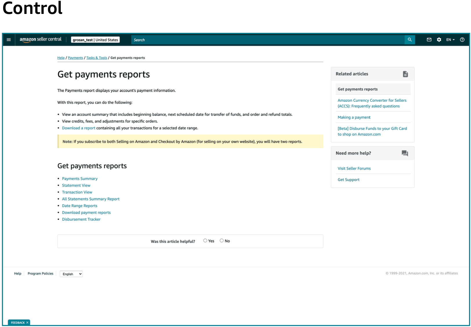
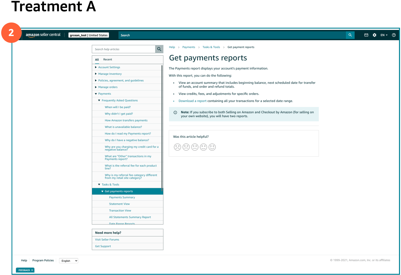
To make help articles more findable, I made the product decision to include the full library of help content on every article page. The hypothesis was that more visibility of related articles would lead to more browsing of help content and therefore more chances the SP will find the answer to their question without contacting support.
The treatment I introduced features a left-side navigation, showcasing the depth of content available to help them. The custom UI pattern was chosen because it aligns with the system visual design but accommodates the specialized customer need, and the developer scoring showed minimal effort difference.
4 Results
An A/B test was performed to compare the control and proposed treatment. While it was not possible to accurately measure if a user went on to contact live support, tracked engagement with the new side navigation showed users viewing more help articles per session under the treatment. Alongside this, there was positive qualitative data from unmoderated usability research. Users described the new layout as “easy,” “clear,” and something they would want to “explore.”
Work together
grace.anderson@ganderful.com
TruStage
Amazon
Brivity
UX Consultant | Amazon | 2021
Help articles for third-party sellers
A resource bank ready to be surfaced
1 Context
Before there was Amazon Prime, Basics, or Essentials, the platform relied on their third-party sellers to supply the marketplace with listings. Now, the platform supports over 400,000 selling partners (SPs). Just like people hitting the buy now button, SPs are viewed as customers. And customers demand support when something unexpected happens. I worked on user experience exclusive to the SPs who click “Help.”
The most expensive form of customer support to Amazon is direct communication with a live representative over the phone or in chat. Static help articles are the most consistent and cost-effective option because there is no variability in the information and it’s completely reusable. Directing traffic for simple and common questions to help articles keeps the lines for live support clear for issues requiring human intervention.
2 Evaluation
Over 4,000 help articles exist specifically for SPs. What users don’t know is live support agents reference the same help article content. Thus, having available information was not the problem.
At first stakeholders assumed the low performance of help articles was due to users’ overall distaste for reading and preference for live support. To test this assertion, I championed a usability study to observe how SPs interacted with the help content. I interviewed several users who genuinely prefer getting help by reading the articles, but would contact support when they were unable to find the right content. This insight drove the product direction.
3 Treatment
To make help articles more findable, I made the product decision to include the full library of help content on every article page. The hypothesis was that more visibility of related articles would lead to more browsing of help content and therefore more chances the SP will find the answer to their question without contacting support.
The treatment I introduced features a left-side navigation, showcasing the depth of content available to help them. The custom UI pattern was chosen because it aligns with the system visual design but accommodates the specialized customer need, and the developer scoring showed minimal effort difference.
4 Results
An A/B test was performed to compare the control and proposed treatment. While it was not possible to accurately measure if a user went on to contact live support, tracked engagement with the new side navigation showed users viewing more help articles per session under the treatment. Alongside this, there was positive qualitative data from unmoderated usability research. Users described the new layout as “easy,” “clear,” and something they would want to “explore.”
Work together
grace.anderson@ganderful.com
TruStage
Amazon
Brivity
UX Consultant | Amazon | 2021
Help articles for third-party sellers
A resource bank ready to be surfaced
1 Context
Before there was Amazon Prime, Basics, or Essentials, the platform relied on their third-party sellers to supply the marketplace with listings. Now, the platform supports over 400,000 selling partners (SPs). Just like people hitting the buy now button, SPs are viewed as customers. And customers demand support when something unexpected happens. I worked on user experience exclusive to the SPs who click “Help.”
The most expensive form of customer support to Amazon is direct communication with a live representative over the phone or in chat. Static help articles are the most consistent and cost-effective option because there is no variability in the information and it’s completely reusable. Directing traffic for simple and common questions to help articles keeps the lines for live support clear for issues requiring human intervention.
2 Evaluation
Over 4,000 help articles exist specifically for SPs. What users don’t know is live support agents reference the same help article content. Thus, having available information was not the problem.
At first stakeholders assumed the low performance of help articles was due to users’ overall distaste for reading and preference for live support. To test this assertion, I championed a usability study to observe how SPs interacted with the help content. I interviewed several users who genuinely prefer getting help by reading the articles, but would contact support when they were unable to find the right content. This insight drove the product direction.
3 Treatment
To make help articles more findable, I made the product decision to include the full library of help content on every article page. The hypothesis was that more visibility of related articles would lead to more browsing of help content and therefore more chances the SP will find the answer to their question without contacting support.
The treatment I introduced features a left-side navigation, showcasing the depth of content available to help them. The custom UI pattern was chosen because it aligns with the system visual design but accommodates the specialized customer need, and the developer scoring showed minimal effort difference.
4 Results
An A/B test was performed to compare the control and proposed treatment. While it was not possible to accurately measure if a user went on to contact live support, tracked engagement with the new side navigation showed users viewing more help articles per session under the treatment. Alongside this, there was positive qualitative data from unmoderated usability research. Users described the new layout as “easy,” “clear,” and something they would want to “explore.”
Work together
grace.anderson@ganderful.com